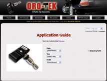
This is an example of a short press release I sent to a long list of publications. I’m always pleased when we get printed press yet digital press is valuable too, especially when it comes with a hyperlink to our…

This is an example of a short press release I sent to a long list of publications. I’m always pleased when we get printed press yet digital press is valuable too, especially when it comes with a hyperlink to our…
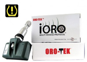
When sending out product releases to various publications it is important to adhere to their guidelines. Since guidelines vary, particularly in the number of words permissible, I am in the habit of stocking several versions for a quick turnaround. Here…

For this short article I was given the title and a mathmatical formula. From there, I came up with the copy and the the royalty free image. The article is on the Orotek website home page with a link to…

In keeping with the first concept this one uses an iconinc image without copyright infringement. Although he may look like a superhero he is just a business man (me really). Again this QR resolves to the home page of this…

I designed this image as an example of how a Quick Response (QR) code could be incorporated into a marketing campaign. Marketing materials have to make you look. With QR Code there is no need for long paragraphs of text.…

This ad was a full color 3/4 page ad in SEMA Daily news for the SEMA Show 2011. We needed an ad that was mostly image rather than the fully loaded text of previous advertisements. I originally designed the swoosh…
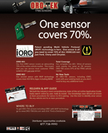
This single page ad targets retailers and was published in Tire Business magazine throughout May 2011. This download is low resolution for the web. The print version is 300 dpi cmyk. Highlights include: •Teaser – One Sensor Covers 70% /…
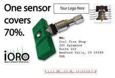
I designed these postcards to be branded by the retailer. The content is similar to the single sheet iORO Jobber flyer. This project is a good example of my ability to produce print materials according to guidelines. Postcards require spaces…

Take the four-page flyer and condense it to two pages (1 front and back sheet) and you get this flyer intended for distributors to brand and send to their retailers. This is a good example of my skill at reducing…

This is another 4-page full color foldout flyer for which I created the graphics and wrote the copy. This one centers on a new product called iORO. I did the logo too. Low Res Download (PDF 1.4 mb) Front Cover…